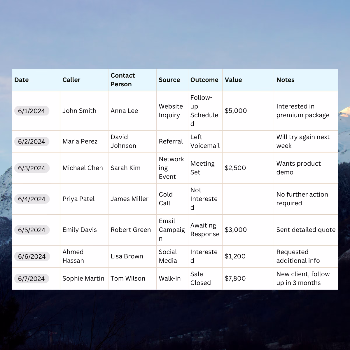
See how can you customize your call analytics dashboard in a few simple steps.
As a Nimbata user, most probably you are familiar with the function of analytics dashboards, which serve as a main spot to access, analyze data, and make your business decisions. Their functionality is really valuable, and even more when users can create their own customized dashboards, according to their preferences and business goals. Empowering users to tailor dashboards around their most crucial KPIs helps them:
- Have a clear overview of account performance on the same page.
- Eliminate wasted time gathering data and creating reports.
- Speed up their decision-making process.
As we are constantly trying to extend the functionality of Nimbata for our customers, we have implemented the customizable call analytics dashboard as an extra feature in our newly updated app. And we trust you will tap into its usefulness for the sake of your business and clients.
For this reason and in order to help you make the most of this new option available in your accounts, we have prepared the following guide to showcase how you can create your own customized dashboards in a matter of seconds.
Let’s start then!
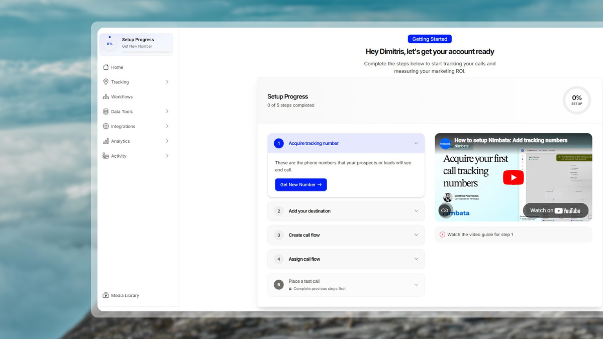
- Login to your Nimbata account and navigate to the Analytics section.
- From the drop-down menu click on “Dashboard” to get in front of Nimbata’s default dashboard.

- Here you can remove the tables you don’t care to monitor by clicking on the [X] icon on the left corner of each. Please note you can add them back whenever you wish. You will learn how in the next step.

- Add those tables you want to look into by clicking on the [+] button at the bottom right corner of the screen.

More specifically, from here you can pick data which are grouped based on the following categories:
- Brand (Monthly Trend, Missed Callers by hour)
- Source (Calls, Call Distribution, Average Call Duration, New vs. Repeat Callers, Daily Trend, Weekly Trend, Monthly Trend, Missed Callers, Who Hung Up, Missed Callers by hour)
- Tracking Number (Calls, Call Distribution, Average Call Duration, New vs. Repeat Callers, Daily Trend, Weekly Trend, Monthly Trend, Missed Callers, Who Hung Up, Missed Callers by hour)
- Aggregates (Duration Breakdown, New vs. Repeat Callers)
- Destinations (Daily Trend, Call Distribution, Average Call Duration)
- Stretch or downsize tables using the arrows at the right and left edges of each table, to view performance data in more detail, and vice versa.

- Move the tables by dragging them upwards or downwards to prioritize what you need to see first.
- If you need to isolate two or more items in a table to examine them more thoroughly, you simply click on the items- at the bottom of each table- you want to remove temporarily and Nimbata will readjust the table that is displayed, keeping out the items you selected to be removed. Click again on them to restore.

Now, what happens with users handling multi-client accounts? Well, in case you are handling a multi-client account and want to monitor- even from your smartphone- quickly and massively your accounts’ effectiveness, Nimbata’s customized dashboard will really make your life easier!
This means that, in a few clicks, you can customize your dashboard in such a way so as to check on the go key metrics of your accounts and get an overall sense of how your brands are actually performing.
How is this done?
Simply select “All Brands” from the drop-down menu on the Navbar and add the “Calls per Brand” view as it is described above.
This is it!
At this point, we would like to mention that you can restore your dashboards to the default version whenever you need, by clicking on the button “Reset To Default” at the bottom of the page. We hope that this new feature will help you drill down into your callers’ data in a more quick and easy way to take your business performance to the next level!
As always, we will be more than happy to receive your feedback at support@nimbata.com.