Let’s start with a disclaimer. A perfect Call to Action (CTA) cannot stand alone. Your content, tone of voice, language, colors, typography and creatives should complement it and prompt your visitor click on the cta.
So… What is a Call To Action (CTA)?
A Call to action is what road signs are to navigation. Road signs guide travelers to their desired destinations and as such a Calls-to-action (CTAs) are essential elements in lead generation. CTAs direct potential customers in the world of business. They grab people’s attention and prompt them to take specific actions, such as signing up for a newsletter, downloading a free guide, or making a purchase. CTAs act as friendly guides, leading potential customers through the journey of exploring your products or services and ultimately becoming a part of your business.
Why are CTAs important?
Their principle is simple: tell visitors and users what they should do next. You know, like those buttons you see on websites or in emails that ask you to do something. They are magical buttons that make people do fun and exciting things on the internet. CTAs help businesses make new friends, sell cool toys, or share interesting stories with others. They make it easy for people to take action and join in on the fun!
Let’s dive in and learn what it takes to create such amazing buttons
What Makes a CTA Super Cool?
To make a CTA really awesome, we must remember a few things. First, it should be clear and easy to understand. We don’t want anyone to be confused about what to do and get up lost, right? Second, we use special words that make people excited to click the button. These words might say things like “Join Now,” “Get Your Toy,” or “Watch the Video.” They spark emotion and make us feel like we’re going on a big adventure!
How can we create an effective CTA?
To make CTAs even more exciting, we can use colors and pictures that catch our attention. Bright and bold colors like red, blue, or yellow make the buttons stand out. We can also use fun pictures or symbols that show what the button is all about. This makes us want to click on them and discover something amazing!
How can we make sure our CTAs work well?
We can’t forget to make sure our CTAs are working their very best! One way to do this is by trying different versions of the buttons. We can change the words, colors, or even where the button is on the page. Then, we see which version makes more people convert. This helps us know what works best and make our buttons even better!
7 Cool CTA Examples that made me say “Show me more”
1. Sharebite

Why I like it:
- It’s simple
- The copy says it all, there is no need for an explanatory cta.
- CTAs have hierarchy
- It gives me 2 options. Do I want to learn more? I know where to click. Do I want to buy? I know where to click.
2. Take Profit
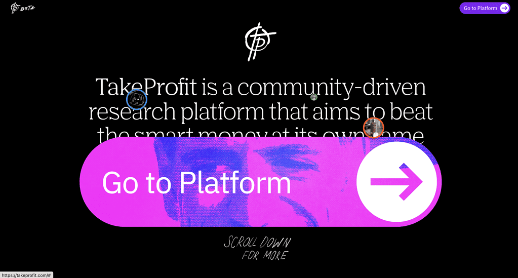
Why I like it: It’s bold, clear, stands out, fun and grabs attention.
3. The Lovie Awards

Why I like it: It’s clear and creates a sense of urgency to take action.
4. Dirt

Why I like it: It’s triggering my curiosity. It’s a soft conversion to gain data for nurturing, learn more about your leads, and entertain your potential customers. It’s a win-win situation. It just works for me.
5. Sanrok Studio

Why I like it: Despite the CTA (Find out how) being quite mainstream and significantly smaller than usual, the heading makes me curious to learn more just because mamas are always right.
6. Linktree

Why I like it: Its simplicity. The copy makes me feel like it’s as effortless as writing down my own name. With so many accounts across various platforms, when I have to create a new account, I want it done in just 2 steps, and Linktree has managed to give me that confidence.
7. Legent

Why I like it: This company truly understands its customers. While phone calls might not be a typical call-to-action in all industries, in the Healthcare sector, patients prefer to make a call to book an appointment or seek expert advice. Legent Health has made it incredibly convenient for its potential customers to access these services.
Takeaway
Creating awesome CTAs is an art, when you nail it, it’s like being a magician who knows how to drive people to action. They are the secret sauce that fuels lead generation campaigns. By making our CTAs clear, exciting, and visually appealing, we can encourage people to join us in our adventures, discover new things, and have a great time together. So, let’s create some awesome buttons that’ll make the business thrive, meanwhile make the internet more exciting for everyone!